


CSS POSITIONING
This is a very tricky topic, when I was learning CSS POSITIONING it was so confusing I spent several weeks trying to understand it. So let's see the different CSS positioning and how we can use it.
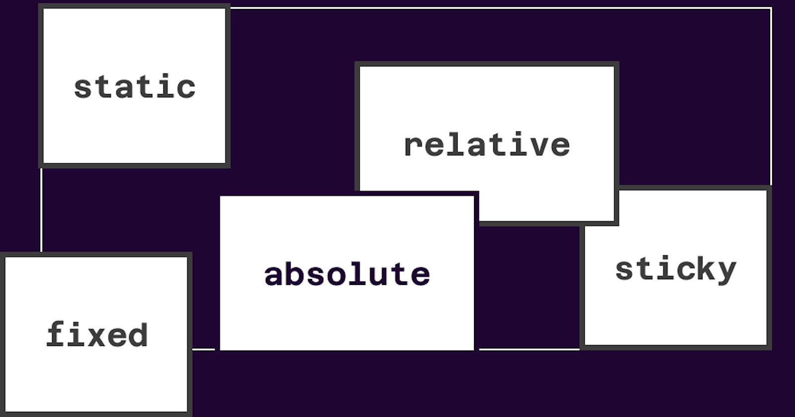
There are 7 CSS position properties :
- Static
- Absolute
- Relative
- Fixed
- Sticky
- Inherit
- Initial
In this article, we'll be focusing on numbers 1-5 because they're the most commonly used position properties.
STATIC POSITION
Normally HTML elements are static by default. it is always positioned according to the flow of the webpage. They appear directly below one another, according to the order of the HTML code.
Static-positioned elements are not affected by the top, bottom, left, and right properties.
Example:
HTML
<!DOCTYPE html>
<html lang="en">
  <head>
    <meta charset="UTF-8">
    <meta http-equiv="X-UA-Compatible" content="IE=edge">
    <meta name="viewport" content="width=device-width, initial-scale=1.0">
    <link rel="stylesheet" href="style.css">
    <title>CSS Position Properties</title>
  </head>

  <body>
    <div class="parent">
      <div class="box one">One</div>
      <div class="box two">Two</div>
      <div class="box three">Three</div>
      <div class="box four">Four</div>
      <div class="box five">Five</div>
    </div>
  </body>
</html>
Style
body {
  margin: 100px auto;
}

.parent {
  width: 500px;
 height: 900px;
  border: 1px solid red;
  margin: auto;
  text-align: center;
}

.box {
  border-radius: 10%;
  width: 100px;
  height: 100px;
  margin: 20px;
}

.one {
  background-color: red;
}

.two {
  background-color: royalblue;
}

.three {
  background-color: darkgoldenrod;
}

.four {
  background-color: green;
}
Output
 The above image is a static position
This default positioning doesn't leave any room for flexibility or to move elements around.
RELATIVE POSITION
Relative works the same way as static, but it lets you change an element's position.
To move the element, you'll need to apply the top, bottom, right, and left properties mentioned earlier and in that way specify where and how much you want to move the element.
The top, bottom, right, and left properties push the tag away from where it's specified, working in reverse. for example
top moves the element towards the bottom of the element's parent container. bottom pushes the element towards the top of the element's parent container, and so on.
You can move the first square to the left
  .one {
    background-color: red;
    position: relative;
    right: 50px;
  }
Output

In the above image, the square element has moved 50px from the left of where it was supposed to be by default.
Relative position changes the position of the element relative to the parent element and relative to itself, meaning that it's relative to its original position within the parent element.
You can change the order in which elements appear on the page using Offsets and Relative position.
Example
  .one {
    background-color: red;
    position: relative;
    top: 110px;
  }

  .two {
    background-color: royalblue;
    position: relative;
    bottom: 110px;
  }

In the above example, the second square appears on top of the first one.
ABSOLUTE POSITION
Absolute-positioned elements are completely taken out of the regular flow of the web page.
They are not positioned based on their usual place on the webpage, but based on the position of their parent. if you apply absolute position to the main or self element you will get a different result.
Let's use the third box as an example
.three {
    background-color: darkgoldenrod;
    position: absolute;
  }
Output

In the above example, the third box runs down to the fourth box
Now if you add some offset properties like top and right it will look like this
  .three {
    background-color: darkgoldenrod;
    position: absolute;
    top: 30px;
    right: 0;
  }
Output

In the above example, the square completely left its parent element because the offset properties top and left are based on the whole page.
If the offset properties are applied to its parent element like this\
  .parent {
    width: 500px;
    border: 1px solid red;
    margin: auto;
    text-align: center;
    position: relative;
  }
Output
 ,
,
In the above example, the third box comes back into the parent when you apply relatively position to the parent element
STICKY POSITION
A sticky position has the features of a static position until the parent element is scrollable, once you scroll past its initial position, it will remain fixed like the example below
  .four {
    background-color: green;
    position: fixed;
    bottom: 100px;
  }
Output
FIXED POSITION
A fixed position element is positioned relative to the body of the page, so when a page is scrolled the fixed element stays right at its initial position. like Absolute, Fixed also forgets its Parent positioning and adapts the new position relative to the body of the page.
Example
  .five {
    background-color: palevioletred;
    position: fixed;
    top: 300px;
    bottom: 300px;
    right: 700px;
  }
Output
In the above example, the fifth box maintains its position when the page is scrolled.
INHERIT POSITION
The Inherit position search for the closest parent element’s value and let the current element inherit that value. Read more about Inherit position
INITIAL POSITION
Every CSS has an initial value, this value resets the CSS property to its initial value, and this may be confusing at times because the initial CSS value for properties is not always what you think it is the browser’s default styles also play a part. Read more about Initial position
SUMMARY
CSS position properties can be fun and interesting if you understand how and when to use them. I hope you had fun practicing.